Here’s the transcript from Ryan Henry’s presentation:
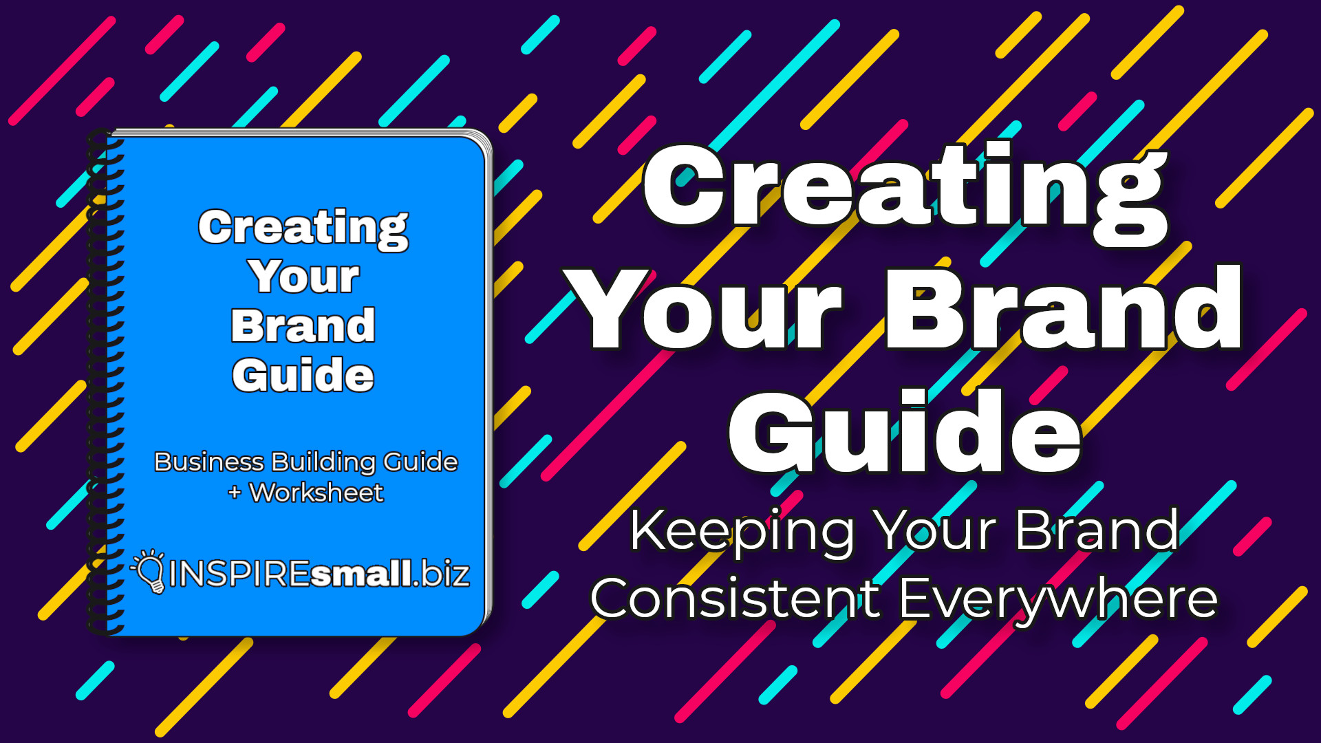
Ryan: Now I want to make sure we spend plenty of time talking about our topic and I’m dropping it in the chat because there is a PDF work guide that goes with what we’re going to talk about today that each of you will be able to download, fill out and save so that you have your own brand style guides moving forward in the New Year.
Ryan: So, what is a brand style guide?
Ryan: Well, it is a single document that contains all of the information for making sure that your brand looks consistent anywhere you advertise your business.
Ryan: So, think of it even as small business owners, we have business cards.
Ryan: We have brochures.
Ryan: We have car magnets.
Ryan: We have social media graphics.
Ryan: We have our logo displayed on our website.
Ryan: We have other assets that we utilize to share through different venues of and channels of marketing.
Ryan: So, a brand style guide is really that important component that’s going to make sure that everywhere you go to advertise your business, customers know without a single doubt that it is indeed your business that’s being advertised, so.
Ryan: I’m going to share my screen and go through the workbook and if anyone has trouble finding or downloading it, please let me know before the end of this meeting today so that I can get you a copy directly so.
Ryan: We’re going to talk really quick about some of the things that are included in the brand style guide and the first thing to talk about is your logo.
Ryan: Because your logo is the single most identifiable way to see who your business, what your business is so.
Ryan: You want to make sure that you, in addition to the full color logo that you have, so all of the colors that are in there that you also have a format in a single color.
Ryan: And the reason for that is when it comes to printing things, we’re not always going to have access to a color printer, and Gray scaling the different colors in your logo without any, without consideration to how it’s going to come out of the printer, could cause some really bizarre things to happen.
Ryan: So, you want to make sure that you have the full color styling of your logo set up as well as a one-color logo for use in format that color isn’t something you’re able to utilize.
Ryan: Next, let’s talk about fonts.
Ryan: Now fonts don’t really get as much attention as they deserve, but they make a huge difference when it comes to marketing our business.
Ryan: So, just by a quick show of hands, how many of you have designed a logo and just, or designed business cards and just use the default font that pops up on your design program? Anyone here in this meeting?
Ryan: OK, so a couple of things to consider- as far as fonts if you’re going to use some that are by default available on your computer, that’s OK, but you want to make sure that once you start using one single font that you’re always using it, everywhere that you advertise.
Ryan: Now you should choose more than one font as part of your branding, so.
Ryan: You need a header font, which is typically a thicker, bolder, more standout font and then a body font, so something that’s not quite as thick, but the two fonts complement each other because there’s still elements of what your brand does, so.
Ryan: What you see here in the guide is 2 fonts sitting next to each other.
Ryan: Roboto Condensed and Railway.
Ryan: So, you’ll see that the one on the left, the Roboto Condensed is a bolder font versus Railway on the right.
Ryan: So, make sure that you’ve planned out both a font to use as the header for all of your text, as well as the body.
Ryan: Now this is something that you’ll have full and complete control of in any printed material that you design.
Ryan: As well as your website, assuming it’s one of the functionalities you have now.
Ryan: On a quick note, if you’re using a WordPress website, there are all kinds of plugins out there that will let you control your fonts.
Ryan: Many of the other website builders out there that you utilize give you that ability as well, so make sure that you have those same fonts being utilized everywhere because that subtle difference can make a huge change in the appearance of your brands somewhere.
Ryan: So next, let’s talk about colors.
Ryan: Now there’s a couple of different formats of color that we want to talk about.
Ryan: The first is going to be RGB or red, green, blue.
Ryan: That’s typically the way we think of color when displayed electronically.
Ryan: So, a good way to look at that would be the hex hexadecimal key, and that’s the # followed by 6 digits.
Ryan: Two representing green, two representing red, two representing blue.
Ryan: And then there’s the CMYK format which is how color comes out of a printer by way of adding magenta, cyan, yellow and black.
Ryan: So those two colors, when you choose the colors utilized for your brand, I recommend using something called Encycolorpedia.
Ryan: And do some research on the colors chosen for your brand palette and what the conversion is going to be when going from a digital color to a printed color and a great example of that is I actually had this happen years ago, designing a logo for my computer repair company.
Ryan: I loved the color when it displayed on the computer. It was a Royal blue, but when I sent the business cards to be printed and ordered tons of them and I go to pick them up, not having done that conversion to consider what it would come out of a printer.
Ryan: That royal blue on my screen was a purple business card.
Ryan: So, it’s really important that you understand the difference between a digital color and a printed color before you go and have a bunch of things printed for your business.
Ryan: Now there’s a couple of different ways that we can pair colors together.
Ryan: Since most of us will utilize more than one color in our logo, we want- a couple of the pairing models are monochrome, which are different shades of the same or very similar color.
Ryan: There’s analogous, which is some slightly different colors, but still in that same feel, and then complementary colors, which are kind of stark differences that work well together.
Ryan: So, think about that when you’re choosing the colors that you’re going to use.
Ryan: How are you pairing them together so that they look well together? And so, other things to think about.
Ryan: If you want to use a really strong, powerful color like a red or an orange or something super bright, consider ways of how you’re going to utilize that color everywhere because too much of very strong colors can easily send the wrong message through your branding material.
Ryan: For example, too much red could represent panic.
Ryan: Too much yellow could mean overly youthful and or immature, so just look at how you’re balancing those colors that you have and if you have a favorite color that you know you’re going to start with, that’s OK.
Ryan: Just make sure the other colors that you’re putting together with it look well together and create the mood that you’re trying to cultivate with your branding.
Ryan: Uhm, so we’ll talk, we kind of covered this a little bit warm colors- so red could convey passion, love. Orange can be a very active and energetic feel.
Ryan: Yellow is bright and attention getting, but it could also represent caution.
Ryan: We think about yellow and highway signs telling us when there’s a ramp about to merge or other important to know information.
Ryan: Cool colors- green is typically a color of nature and natural and financially set or secure.
Ryan: Blue is usually a reliable and trustworthy color.
Ryan: Purple is usually a spiritual or royal feeling color.
Ryan: Some of the neutral colors out there are brown, which could be natural, black could be sophistication and elegance, white could be simplicity, but too much white could make your logo or your branding feel sterile.
Ryan: So, this is why it’s important to look at the colors together and make sure that they’re creating the feeling that you want with your brand, not just utilizing color for the sake of using color.
Ryan: So, let’s see here.
Ryan: So, moving over to the actual brand guide assembly here.
Ryan: So, this is the component where you put your workbook together so that you always have it for yourself to utilize.
Ryan: So, make sure that you’ve put examples of your full color logo as well as an alternate one-color logo that you’re going to use.
Ryan: This way you can come back and reference it and make sure that when you’re putting something together that it matches what you have already designed.
Ryan: Let’s see here.
Ryan: So, then moving on to fonts now, it is important to note that the default fonts that come with your computer are probably OK to utilize, but be sure by doing a quick check online to make sure there isn’t any licensing tied to using fonts that are out there now.
Ryan: Those of you who have downloaded special fonts for the use of creating your branding, make sure that you’ve documented what the license is.
Ryan: If you’re using something like Adobe Creative suite, you do get access to various fonts through their services, but make sure that you are respecting any license terms set up there, because it creates unnecessary legal burden for you if you don’t.
Ryan: Now a couple of good ideas on where to find free fonts.
Ryan: I’m a very big advocate of looking through Google Fonts.
Ryan: They use the fonts that are open source so they don’t carry a license with any kind of financial commitment.
Ryan: So do a quick search there and if it is a font that you would use that would cost a licensing fee and you don’t want to pay licensing, look at Google for something very similar to that because they have a lot of good options out there that you would be able to utilize.
Ryan: Uhm, and do that for all of your header and body fonts.
Ryan: Now if you have additional fonts that you use.
Ryan: So, for example, if your primary header is 1, but you also want a secondary header, you could continue to do that.
Ryan: There really is no limit to how many fonts you could utilize.
Ryan: But you do want to make sure that you have them documented, including the ideal usage.
Ryan: So, if you’re picking additional fonts for header 2, header 3, header 4 on your website, or branding material that you have it documented in here, that that’s exactly how that is being used.
Ryan: Let’s see.
Ryan: So, moving on to colors here.
Ryan: So, as I mentioned earlier, there’s a difference between a digitally displayed color and a printed displayed color.
Ryan: So, I do recommend using Encycolorpedia to get your conversions from one to the other.
Ryan: But make sure that you’re documenting both in there, because each program that you utilize to design material is going to have its own way of plugging color in. For example, if you’re using Microsoft Publisher, you traditionally have the option of RGB, which is representing Red, green and blue, and numbers through zero through 255 or the hex key, which is the # followed by 6 characters, two representing Red, two representing Green, two representing blue, and then CMYK, which is traditionally expressed in percentages.
Ryan: So, the best way to explain our RGB and HEX is that it’s going to display different light of those colors to get to the exact shade you want.
Ryan: Versus CMYK, which is a percentage of ink applied to a material, usually paper, to be able to get the exact shade that you’re looking for.
Ryan: Then once you have both of those numbers and have documented them, make some notes about how you’re utilizing your color.
Ryan: So, for example, if half of your logo utilizes one color, make sure to have that written out.
Ryan: These written instructions could come in handy later on if you’re ever partnering with a graphic designer or a printing company and they’re trying to design something more intensive than you already have.
Ryan: Let’s see.
Ryan: So, then the very last page here of the workbook is really just a condensed single sheet that has all of your branding information on it, so that if you just want the easiest, quickest way to pin up something here in your office or give it to someone that you’re working with, it’s a single place to make sure that your brand stays consistent anywhere you want it to be.
Ryan: So, that is what is in the guide.
Ryan: So, what I would like to do is open it up for any questions that people have.
Ryan: Yes, Tanya.
Tanya: I recently had my logo redone by an online resource and when they sent back the logos they sent them in a square shape and that’s useful in a lot of cases.
Tanya: But when I wanted to create my letterhead, I noticed that it took up too much space.
Tanya: How can I have that condensed, so that it’s more rectangular and it doesn’t take up as much of the page?
Ryan: I would recommend there that you experiment with padding space on the sides to try and bring it more in into uniform with where you want it to fit on your letterhead.
Ryan: But an alternative to that would be to ask that designer to create an alternate meant for that purpose, so that it still utilizes your color and font, but in a way customers are going to recognize.
Tanya: Is there a certain name for that style in a rectangle versus something that’s in a box elsewhere?
Ryan: So, you want to reference the space or the shape of the space you’re trying to fill.
Ryan: So, since you have a square logo or at least a squared shape, you could refer to it as a rectangular display or a more horizontal displayed logo.
Tanya: Thank you.
Ryan: You’re welcome.
Ryan: Other questions?
Speaker 2: Ryan, you did put this in very simply because I did work with Nokia with Apple computers and all this and their guides were like Bible so we have to go through them. So in these 1/2 pages we can at least simplify our process, no? Thank you.
Ryan: Yes, and everything has to start with small steps.
Ryan: So, if all of us are building our businesses and getting going, we need to enforce that consistency right away.
Ryan: Then as our brands continue to grow, we introduce other things.
Ryan: So, then we could start talking about branding consistency for video content, so if we’re producing videos of ourselves or commercials that we enforce consistency, and Apple’s a great example because anywhere you see an ad for them, TV, print over the Internet, the package when you finally buy the product, there’s no doubt it is an Apple product.
Speaker 2: Yes, thank you.
Ryan: Other questions or comments?
Ryan: Yes Tanya.
Tanya : Do you have any recommendations as to how often a company should update their brand?
Ryan: Not necessarily. A good rule is that as long as your brand still fits the mission and values of yourself as an entrepreneur; Bless you; and as long as your customers are still connecting with your brand in a meaningful way, there’s no reason to screw up a good thing.
Tanya: Thank you.
Ryan: Other questions or comments?
Speaker 4: So, Ryan, I got a question about colors.
Speaker 4: You said, you know I love the explanations that you gave about the colors out. That’s brilliant.
Speaker 4: Uhm, what do you find in, do you find that at certain regions like Indianapolis, certain colors work better for this region and are more memorable to the people who live here versus other regions like, say Miami or other places?
Ryan: So, I do not have specific regional data.
Ryan: However, usually the identity of the individual is pretty reliable.
Ryan: So, for example, gentlemen in their 40s are going to have a certain set of colors that they feel strongly for.
Ryan: As would ladies in the same age bracket have their own commonalities now. Inside of that there can be some outlier differences because no one is exactly the same, but you usually see some general ideas. For example, when you’re dealing with the over 65 demographic here in the United States, the colors red, white, and blue always come up as favorably viewed, but depending on the balance of the colors together, your meaning and favorability of it can vary drastically.
Speaker 4: Do you say the same thing about fonts?
Ryan: I’m sorry, say that again?
Speaker 4: The font size or the type of font that you used, do you find that this being the same thing?
Ryan: Yes, that each group has other things that they, that they favor.
Ryan: It is also important to note though, that the simpler the font in your in your branding, the better, because you want it to be easy to read even at far distance.
Ryan: So, if you’re looking at your business card, you don’t want to have to squint to read what’s going on in the logo and at the same time when you’re ready to buy a billboard on the side of the Interstate, you want someone to be able to see 2500 feet back from the Billboard.
Speaker 4: Good stuff.
Kim: I don’t have a question, but I have a comment.
Kim: I have a visceral reaction to that playful, that playful font. What I don’t know if there’s a name for it, Ryan. Where’d you go? I can’t see you, oh, there’s your face. Do you know what I’m talking about?
Kim: It, a lot of daycares will use it, I don’t know what it’s called, but it’s real playful.
Ryan: Decorative fonts.
Kim: It’s almost like a child like a, and I see it a lot and I’m OK with It for like a play center or you know, a daycare or something like that. But man, people should not use that in business. I just have a reaction to that. It just it’s horrible. Do you know what I’m talking about?
Ryan: I mean, I have an idea. You’re referencing an example of a brand that the voices of their font don’t fit, who they are and who they’re -.
Kim: Hey, exactly, exactly yeah. Yeah, so hopefully no one on here has that font, ’cause I’ve just totally offended you, but if you do have that font, you’ve offended me so.
Kim : You know, Jeanette, you know doing what she does, I mean it would be silly for her to have that real super playful font. You know, it’s just don’t do that in business. Unless you run a daycare.
Ryan: Well, and it all comes back to the mood and the vibe that you’re trying to cultivate in your branding, because you can do a lot of things to start an emotional attachment with your customers before they even reach out to purchase from you.
Ryan: So, Kim, you referenced a great example of opportunities that a business-